Saturday, August 29, 2009

..\/,

Greetings Earthlings, I come in pieces of vocabulary words.

Such as:

1. Absolute measurement: Measurements of fixed values. e.g. a millimeter is a precisely defined increment of a centimeter.
2. Relative measurement: Many measurements, such as character spacing, are linked to type size, which means that their relationships are defined by a series of relative measurements. e.g. Ems and ens.
3. Point: Unit of measurement used to measure the type size of a font. e.g. 7pt Times New Roman. This measurement refers to the height of the type block, not the letter itself.
4. Pica: a unit of measurement equal to 12 points that is commonly used for measure lines of type. e.g. there are six picas ( or 72 points) in an inch, which is equal to 25.4 millimeters.
5. Em : Unit measurement used in typesetting to define basic spacing functions, and therefore it is linked to the size of the type. It is a relative measurement n that if the type size increases, so does the size of the em. An em equals the size of a given type. e.g. the em of 72pt type is 72 points and the em of 36pt type is 36 points and so on.
6. En: Unit of relative measurement equal to half of one em. e.g. In 72 type an en would be 36 points.
7. Legibility: body of knowledge, research, and opinion to which designers refer selectively, rather than a subject governed by any single unified theory or categorical law.
8. Rag:
9. Type alignments:

Flush left: Type set to an even left margin, giving an uneven or ragged right margin.
Advantages: The space between words remains consistent. This is important to the readability of the text-the ease with which the reader's eye traces the progression from one word to the next. It also ensures an even texture to a column of type, maintaining an even "gray value" from line to line.
Disadvantages: Asymmetry-the ragged right margin may disturb the balance of an otherwise symmetrical page layout. However, this might equally be listed as an advantage, since asymmetry can be the basis for dynamic typographic compositions.

Flush right: Type set aon a central axis, with even word spacing and ragged left and right margins.
Advantages: It is rarely used for text of any length. It can, however, be extremely effective for setting small bodies of text, captions, and so on within asymmetrical layout, where a ragged left column may create or resolve dynamic tension within the composition of the page.
Disadvantages: Reduced readability-the absence of an even left margin makes it more difficult for the reader's eye to identify the beginning of the next line. This may be addressed by increasing the leading.

Centered: Type et on a entral azis, with even word spacing and ragged left and right margins.
Advantages: although seldom used for the setting of large quantities of contunuous text, centered type can be extrememly effective in the design of single pages in formal contexts.
Disadvantages: Reduced readability-the absence of an even left margin makes it more difficult for the reader's eye to identify the beginning of the next line. This may be addressed by increasing the leading.

Justified: Space between the words is adjusted in each line, giving even margins both left and right.
Advantages: Even margins left and right, giving a neat rectangular text area.
Disadvantages: The space between words will necessarily vary from on line to the next, because each is adjusted to fill the same column width. This requires detailed adjustments to specification ir order to avoid excessive space between words.

10. Word spacing: Space between words. It can be adjusted manually for display and title setting.
11. Rivers: Rivers typically occur in justified text blocks when the separation of the words leaves gaps of white space in several lines.
12. Indent: To set (the first line of a paragraph, for example) in from the margin.
13. Leading:
14. Kerning
15. Tracking
16. Weight: Typefaces customarily include a choice of weights, from the single bold variant common to most text faces to intermediate weights, such as book, medium, and demi.
17. Scale: Content may be differentiated through the scale of type, by increases in point size.e.g. a title or subtitle, an introductory paragraph, or pull-quote may be differentiated from the main text by being set in a larger size.
18. Typographic variation: it is serve to clarify visually for the reader specific kinds of emphasis and prioritization, and to establish consistent distinctions between different kinds of content.
19. Orphan: a child who has lost both parents through death, or, less commonly, one parent.
20. Widow: a woman who has lost her husband by death and has not remarried.

Wednesday, August 26, 2009

Butterflies

For our first project in Visual concepts, I chose THE butterfly as my animal. Why? Simply because of this.


No, not because I have these seeds on my wall. [These plants {seeds} are the homes of Monarch butterflies. Yes I need to plant them. ASAP]


or a fake butter fly... on my wall.
But because I'm just so in love with them! I think.

I made this cutout thing that kinda turned out to loo like a butterfly if you flip it upside down. [Drawing 2, Kligman]

And this... These insects are actually made from a sentence I took from Dr. Sues, "From there to here, from here to there, funny things are everywhere!" Yes it's wood, and yes I used a burning tool to burn it. And notice the butterfly.
[Drawing 2, Kligman]

And this. In this picture, you can't actually see any butterflies can you? No. Why? Because I was too lazy to dig up this one drawing that I drew that had a....... butterfly!!

So because I have this butterfly thing going on, I've decided to continue on it, just like I did with my 'trees' and 'hands'. But this time it'll be butterflies.
;3

Tuesday, August 25, 2009

People

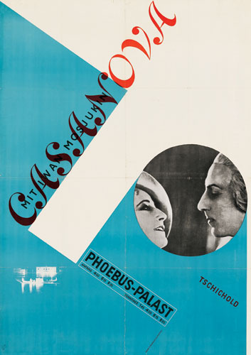
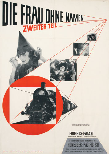
Jan Tschichold was on of the greatest, most outstanding German typographer of the 20th century. He was also an Author that wrote books such as:
  • "Die neue Typografie" (1928)
  • "Typografische Gestaltung" (1935)
The typefaces that he design were:
  • Transit (1931)
  • Saskia (1931/1932)
  • Zeus (1931)
  • Sabon (1966/1967)
These are examples of his work:


----------more will be written on J.T--------------------


Josef Muller Brockmann.

These are examples of his work:


Grid-ness


Grid.
We all love grid.
Can't live without them.
Period.
But what is grid?

I know what it is, but the more I say the word GRID, the more I don't know what it is!
#grid.grid.grid.grid.grid.grid.grid.grid.grid.grid.grid.grid.grid.grid.#


As usual, when stupidity knocks on your my front door, the first thing you I do is go to: www.dictionary.com.
SO! According to the Dr. Dictionary,

Grid is :

1. a grating of crossed bars; gridiron.
2. Electricity.
a. a metallic framework employed in a storage cell or battery for conducting the electric current and supporting the active material.
b. a system of electrical distribution serving a large area, esp. by means of high-tension lines.
3. Electronics. an electrode in a vacuum tube, usually consisting of parallel wires, a coil of wire, or a screen, for controlling the flow of electrons between the other electrodes.
4. Surveying. a basic system of reference lines for a region, consisting of straight lines intersecting at right angles.
5. a network of horizontal and perpendicular lines, uniformly spaced, for locating points on a map, chart, or aerial photograph by means of a system of coordinates.
6. Architecture. a rectangular system of coordinates used in locating the principal elements of a plan.
7. grillage.
8. Football. gridiron (def. 1).


Yes. I literately copy and paste that. As far as I know, the grid I was talking about is grid #4.

But after reading my awesome 'text book' a.k.a. The fundamentals of Typography, I learned that a grid is actually a modernist structure that uses numbers to identify the different cuts. It also breaks space or time into regular units. [Uuuuu]

The reason why WE designers use a grid is because, it makes our lives easier. Specifically, as it was mention on the text, it is intended to make type selection simpler and ultimately more useful. It is a system where you could establish arranging content with in the space of page, screen, or built environment.

For example: Varying a character width is easily achieved by moving one row down the grid from 55 to 65.

And as life continues, we found out that grid has many kids kinds. One of them are called modular grid. Modular grid is a grid that has consistent horizontal divisions from top to bottom in addition to vertical divisions from left to right.

Enough with the grids. There are other things I need to know more about, such as:


Margins a.k.a border, is the space around the printed or written matter on a page.


Columns, a vertical row or list.


Gutter, which I think, is the white space formed by the inner margins of two facing pages in a bound book, magazine, or newspaper.


And flowlins, is... to be honest with you I have no clue what it is. It could be a line that flows.. like a horizontal line? Maybe? maybe not because it's not even a LINE. Which is really confusing. I know, I fail.
Note to self: ask THE teacher!

But what's not confusing is hierarchy. Because hierarchy is a logical and visual way to express the relative importance of different text elements by providing a visual guide to their organization. Ways to achieve a clear hierarchy is by gaining up a weight to a sentence to reinforce its importance.

Then there's 'type family' which is a complete set of type suitable for printing text.
And 'type styles' which is a specific style of type, like Arial.


The End