
_ What are the advantages of a multiple column grid?
So things can be align to each other, it's flexible,
_ How many characters is optimal for a line length? words per line?
45 min-75 max. 66~
_ Why is the baseline grid used in design?
because
_ What is a typographic river?
Gaps of space
"Visually unattractive gaps appearing to run down a paragraph of text. They can occur with any spacing, though they are most noticeable with wide inter-word spaces caused by either full text justification or mono spaced fonts."
_ From the readings what does clothes lining or flow line mean?
things that aligns across the spread
_ How can you incorporate white space into your designs?
by leaving marginal space
_ What is type color/texture mean?
increase the tracking
_ What is x-height, how does it effect type color?
if a font has a taller x-height it's going to look darker, and if it was smaller, it would look lighter.
_ In justification or H&J terms what do the numbers: minimum, optimum, maximum mean?
_ What are some ways to indicate a new paragraph. Are there any rules?
_ What are some things to look out for when hyphenating text.
_ What is a literature?
_ What does CMYK and RGB mean?
CMYK "refers to the four inks used in most color printing: cyan, magenta, yellow, and key black"
RGB " an additive color model in which red, green, and blue light are added together in various ways to reproduce a broad array of colors. The name of the model comes from the initials of the three additive primary colors, red, green, and blue."
_ What does hanging punctuation mean?
_ What is the difference between a foot mark and an apostrophe?
_ What is the difference between
an inch mark and a quote mark (smart quote)?
_ What is a hyphen, en dash and em dashes, what are the differences and when are they used.
Monday, November 30, 2009
Monday, November 23, 2009
Thursday, November 12, 2009
Animators vs. Animation
you can never get sick of watching this.
This one too! http://www.albinoblacksheep.com/flash/animator2
Wednesday, November 11, 2009
Flash.
BLOG: What is Flash and why do we, designers, use it? Check out flash projects online and blog about at least 3.
Flash is, " a multimedia platform originally acquired by Macromedia and currently developed and distributed by Adobe Systems."
We use flash because it creates our 2 dimensional work, into something that can be seen as three dimensional, and with movements. It makes it more interactive.
The three projects that I've enjoyed watching was:
http://awertzberger.com/type1/flash_type1_08/jacobson.html
http://awertzberger.com/type1/flash_type1_08/ratterman.html
http://awertzberger.com/type1/flash_type1_08/stenzel.html
oh and this for its cuteness:
http://awertzberger.com/type1/flash_type1_08/rio.html
The reason why I chose these projects is because not only did I learn by watching them, but it also gave me some sort of entertainment. And they were all created so thoughtfully. Like creating a background image for the feeling of space and depth, and the color pallet which I think I need to be careful with.
Wednesday, November 4, 2009

Tuesday, November 3, 2009
Sunday, November 1, 2009


Thursday, October 22, 2009


Tuesday, October 20, 2009

Sunday, October 11, 2009
Process Notebook.
What? Tomorrow's Monday? and not... Saturday?! Is all I can say about the process notebook.
I spent a ridiculous time on it. Made, stupid, very stupid mistake that gave me extra hours to redo the same thing again. I bet if I were to redo everything right now, it would take just a few hours. Knowing that 90% of the book is done gave me such a relief. It's hard to say, this is the best I could do, because right now, just skimming to it, I feel like I could do so much more... I just wish I had more time, and oh... owning a MAC with all the software would be nice.
I could spend days with it on my bed, in the house, with the kitchen right next door.
Stupid Apple, why do you have to make things so expensive?! I blame the company.
Wednesday, October 7, 2009

Tuesday, September 29, 2009
New Century Schoolbook

1.
2. Designed by Matthew Carter (1937-), and
Morris Fuller Benton (November 30, 1872 – June 30, 1948)
3. It was designed in around 1917-1923.
4. Serif, Transitional.
5. Transitional, also called baroque, was known in the mid-18th century but was formed in the 17th century as an "improved style". This typeface is well know, especially its fonts such as Times New Roman and Baskerville. Transitional is between modern and old style, that's how its name was given. It was called transitional also because of the differences between thick and thin lines of its structure.
6. Georgia, Times New Roman, and Baskerville
7. It was the ending of World War 1
8. Snell Roundhand, Charter BT Pro, and Georgia.
9. Morris Fuller Benton was born on November 30, 1872, and
passed away on June 30, 1948. Although Morris designed
many successful typeface, he did not designed New Century
Schoolbook, however he is the creator of Century Schoolbook.
Morris was one of those designers that was born into the type
business. He was directly influenced by his father, Linn Boyd
Benton,who was a type-founder and the inventor of the matrix-
cutting machine.
Mechanical engineer was what Benton had graduated as, and he
directly went ahead and worked with his father in the newly
established type design department of the American Type Founders
company. From there, he took the advantage and originated, and
completed twenty-three new series. Because Linn invented the
pantographic engraving machine, Morris was able to work with it
with his father, which gave him a strong aesthetic design sense, and
became a master of the technology of his day.
New Century School book is a transitional font because of its
character's thin and thick strokes, and because it was originally a
Century Schoolbook and has been transition to a font called New
Century Schoolbook, designed by Matthew Carter.Carter was born
in London in 1937. His father, who was a typographer, book designer,
and type historian, was the one who introduce him to the world of
typography. As a young man, Matthew went for internship in places
such as L Johannes Enschede en Zonen, typfounders and printers,
Harlem, and Netherlands to study punch cutting. He then
was accepted in Oxford Uiversity in the year of 1956, but rejects
and decided to help his father in organising a small musem
about the history of Oxford University Press.
As years passed by he successfully became a Typographic Advisor
to Crosfield Electronics in 1963. Two years later, after visiting
different places, he then works as staff type designer at Mergenthaler
Linotype, Brooklyn, New York. It was then in 1966, after six years of
work, his script face, Snell Roundhand, became known.
In 1971-1981, he decides to work as a freelance type
designer in London, and was hired by Linotype companies in
the US, Germany and the UK. And until the year of 2004, he
had been a co-founder of a few different companies such as:
Bitstream, Carter & Code Type, has been designing typefaces
like Verdana, Sophia,Miller, Yale, and many more.
10.“ Type is a beautiful group of letters, not a group of beautiful letters.”
http://en.wikipedia.org/wiki/Morris_Fuller_Benton
http://www.designmuseum.org/design/matthew-carter
Graphic Design Referenced by Bryony Gomez-Palacio and Armin Vit
http://www.typophile.com/node/13406
Sunday, September 27, 2009
fonts of fonts of fonts of fonts of fonts?? @_@'
_ Old Style :Adobe Jenson, kj Adobe Jenson (Venetian), Janson, and Garamond.
_ Transitional: Times New Roman and Baskerville.
_ Modern: Bodoni, Didot, and Computer Modern.
_ Slab Serif: Clarendon, Rockwell, and Courier.
_ Sans Serif: Gothic, Grotesque, Geometric Sans.
_ Script: Coronet, and Zapfino.
_ Blackletter: Fraktur, Old English, Rotunda.
_ Grunge: Sidewalk, Trashed, and Dirty ames
_ Monospaced: Courier, Prestige Elite, and Fixedsys.
_ Undeclared:
Fonts
_ Old Style :It's a low contrast with diagonal stress, and cove or "bracketed" serifs (serifs with a rounded join to the stem of the letter).
_ Transitional: Was introduced in the mid-18th century. It have sharper serifs and a more vertical axis than humanist letters. Their sharp forms and high contrast were considered shocking back then.
_ Modern: Was designed by Giaattista Bodoni in the 18th and early 19th centuries. It looks thin, straight serifs; vertical axis; and sharp contrast from thick to thin strokes.
_ Slab Serif: also called square serif or egyptian. It's mono in weight, has square ended serifs, and no stress.
_ Sans Serif: It features circular or geometric letters, with little variation in stroke thickness.
_ Script: they are based upon the varied and often fluid stroke created by handwriting.
_ Blackletter: Also known as Gothic script or Gothic minuscule, its typeface features elaborate thick to thin storeks and serifs.
_ Grunge:
_ Monospaced: every glyph is the same width
_ Undeclared:
Wednesday, September 23, 2009
Adobe Creative Suite 4 80% OFF BUY NOW!
http://tryit.adobe.com/us/cs4/studenteditions/?sdid=DQCOZ
Deadline: Sept 30th.
Who knew they can be so generous. All you need is a copy of your student ID.
Now all I need is a Mac with an 80% off and my life is complete.
Deadline: Sept 30th.
Who knew they can be so generous. All you need is a copy of your student ID.
Now all I need is a Mac with an 80% off and my life is complete.
Thursday, September 3, 2009
8 ways to drive a graphic designer mad.
My brother forward this to me.
So to do my part to save the world from them, I made a list of things you can do when working with a graphic designer, to assure that they have a burn-out and leave this business FOREVER.
1-Microsoft Office
When you have to send a graphic designer a document, make sure it's made with a program from Microsoft Office. - PC version if possible.
If you have to send pictures, you'll have more success in driving them mad if, instead of just sending a jpeg or a raw camera file, you embed the pictures inside a Microsoft Office document like Word or Powerpoint.
Don't forget to lower the resolution to 72 dpi so that they'll have to contact you again for a higher quality version. When you send them the "higher" version, make sure the size is at least 50% smaller. And if you're using email to send the pictures, forget the attachment once in a while.
2-Fonts
If the graphic designer chooses Helvetica for a font, ask for Arial.
If he chooses Arial, ask for Comic Sans.
If he chooses Comic Sans, he's already half-insane, so your job's half done.
3-More is better
Let's say you want a newsletter designed.
Graphic designers will always try to leave white space everywhere.
Large margins, the leading and kerning of text, etc. They will tell you that they do this because it's easier to read, and leads to a more clean, professional look. But do not believe those lies.
The reason they do this is to make the document bigger, with more pages, so that it costs you more at the print shop.
Why do they do it?
Because graphic designers hate you. They also eat babies. Uncooked, raw baby meat.
So make sure you ask them to put smaller margins and really, really small text.
Many different fonts are also suggested (bonus if you ask for Comic Sans, Arial or Sand).
Ask for clipart.
Ask for many pictures (if you don't know how to send them, refer to #1).
They will try to argument, and defen their choices but don't worry, in the end the client is always right and they will bow to your many requests.
4-Logos
If you have to send a graphic designer a logo for a particular project, let's say of a sponsor or partner, be sure to have it really really small and in a low-res gif or jpeg format.
Again, bonus points if you insert it in a Word document before sending it.
Now you might think that would be enough but if you really want to be successful in lowering the mental stability of a graphic designer, do your best to send a version of the logo over a hard to cut-out background. Black or white backgrounds should be avoided, as they are easy to cut-out with the darken or lighten layer style in photoshop.
Once the graphic designer is done working on that bitmap logo, tell him you need it to be bigger.
If you need a custom made logo, make your own sketches on a napkin. Or better yet, make your 9 year old kid draw it.
Your sketch shouldn't take more than 5 minutes to make. You don't want to make something that's detailed and easy to understand, because the less the designer understands what you want, the more you can make him change things afterwards.
Never accept the first logo. Never accept the 9th, make him do many changes, colours, fonts & clip art.
Ask him to add a picture in the logo. Bevels.
Gradients. Comic Sans. And when he's at his 10th attempt, tell him that you like the 2nd one the most.
I know, it's mean but remember: graphic designers are the cause of breast cancer among middle aged women.
5-Choosing your words
When describing what you want in a design, make sure to use terms that don't really mean anything.
Terms like "jazz it up a bit" or "can you make it more webbish?". "I would like the design to be beautiful" or "I prefer nice graphics, graphics that, you know, when you look at them you go: Those are nice graphics." are other options.
Don't feel bad about it, you've got the right. In fact, it's your duty because we all know that on fullmoons, graphic designers shapeshift into werewolves.
6-Colors
The best way for you to pick colours (because you don't want to let the graphic designer choose) is to write random colours on pieces of paper, put them in a hat and choose.
The graphic designer will suggest to stay with 2-3 main colours at the most, but no. Choose as many as you like, and make sure to do the hat thing in front of him.
While doing it, sing a very annoying song.
7-Deadlines
When it's your turn to approve the design, take your time. There is no rush.
Take two days. Take six. Just as long as when the deadline of the project approaches, you get back to the designer with more corrections and changes that he has time to make.
After all, graphic designers are responsible for the 911 attacks.
8-Finish him
After you've applied this list on your victim, it is part of human nature (although some would argue weather they're human or not) to get a bit insecure.
As he realises that he just can't satisfy your needs, the graphic designer will most likely abandon all hopes of winning an argument and will just do whatever you tell him to do, without question.
You want that in purple? Purple it is. Six different fonts? Sure!
At this point, make sure to ask him WHAT HE THINKS - because HE is the designer. This will really send him into a spin.
You would think that at this point you have won, but don't forget the goal of this: he has to quit this business. So be ready for the final blow: When making final decisions on colours, shapes, fonts, etc, tell him that you are disappointed by his lack of initiative.
Tell him that after all, he is the designer and that he should be the one to put his expertise and talent at work, not you. That you were expecting more output and advices about design from him.
Tell him you've had enough with his lack of creativity and that you would rather do your own layouts on Publisher instead of paying for his services.
And there you go.
You should have graphic designer all tucked into a straight jacket in no time!
8 ways to drive a graphic designer mad
As everyone knows, graphic designers are the reason there are so many wars in this world. They get inside our heads with their subliminal advertising, force us against our will to spend money on the worst pieces of shit, and eventually, drive us to depression and random acts of violence. And of course, most of them are communists.So to do my part to save the world from them, I made a list of things you can do when working with a graphic designer, to assure that they have a burn-out and leave this business FOREVER.
1-Microsoft Office
When you have to send a graphic designer a document, make sure it's made with a program from Microsoft Office. - PC version if possible.
If you have to send pictures, you'll have more success in driving them mad if, instead of just sending a jpeg or a raw camera file, you embed the pictures inside a Microsoft Office document like Word or Powerpoint.
Don't forget to lower the resolution to 72 dpi so that they'll have to contact you again for a higher quality version. When you send them the "higher" version, make sure the size is at least 50% smaller. And if you're using email to send the pictures, forget the attachment once in a while.
2-Fonts
If the graphic designer chooses Helvetica for a font, ask for Arial.
If he chooses Arial, ask for Comic Sans.
If he chooses Comic Sans, he's already half-insane, so your job's half done.
3-More is better
Let's say you want a newsletter designed.
Graphic designers will always try to leave white space everywhere.
Large margins, the leading and kerning of text, etc. They will tell you that they do this because it's easier to read, and leads to a more clean, professional look. But do not believe those lies.
The reason they do this is to make the document bigger, with more pages, so that it costs you more at the print shop.
Why do they do it?
Because graphic designers hate you. They also eat babies. Uncooked, raw baby meat.
So make sure you ask them to put smaller margins and really, really small text.
Many different fonts are also suggested (bonus if you ask for Comic Sans, Arial or Sand).
Ask for clipart.
Ask for many pictures (if you don't know how to send them, refer to #1).
They will try to argument, and defen their choices but don't worry, in the end the client is always right and they will bow to your many requests.
4-Logos
If you have to send a graphic designer a logo for a particular project, let's say of a sponsor or partner, be sure to have it really really small and in a low-res gif or jpeg format.
Again, bonus points if you insert it in a Word document before sending it.
Now you might think that would be enough but if you really want to be successful in lowering the mental stability of a graphic designer, do your best to send a version of the logo over a hard to cut-out background. Black or white backgrounds should be avoided, as they are easy to cut-out with the darken or lighten layer style in photoshop.
Once the graphic designer is done working on that bitmap logo, tell him you need it to be bigger.
If you need a custom made logo, make your own sketches on a napkin. Or better yet, make your 9 year old kid draw it.
Your sketch shouldn't take more than 5 minutes to make. You don't want to make something that's detailed and easy to understand, because the less the designer understands what you want, the more you can make him change things afterwards.
Never accept the first logo. Never accept the 9th, make him do many changes, colours, fonts & clip art.
Ask him to add a picture in the logo. Bevels.
Gradients. Comic Sans. And when he's at his 10th attempt, tell him that you like the 2nd one the most.
I know, it's mean but remember: graphic designers are the cause of breast cancer among middle aged women.
5-Choosing your words
When describing what you want in a design, make sure to use terms that don't really mean anything.
Terms like "jazz it up a bit" or "can you make it more webbish?". "I would like the design to be beautiful" or "I prefer nice graphics, graphics that, you know, when you look at them you go: Those are nice graphics." are other options.
Don't feel bad about it, you've got the right. In fact, it's your duty because we all know that on fullmoons, graphic designers shapeshift into werewolves.
6-Colors
The best way for you to pick colours (because you don't want to let the graphic designer choose) is to write random colours on pieces of paper, put them in a hat and choose.
The graphic designer will suggest to stay with 2-3 main colours at the most, but no. Choose as many as you like, and make sure to do the hat thing in front of him.
While doing it, sing a very annoying song.
7-Deadlines
When it's your turn to approve the design, take your time. There is no rush.
Take two days. Take six. Just as long as when the deadline of the project approaches, you get back to the designer with more corrections and changes that he has time to make.
After all, graphic designers are responsible for the 911 attacks.
8-Finish him
After you've applied this list on your victim, it is part of human nature (although some would argue weather they're human or not) to get a bit insecure.
As he realises that he just can't satisfy your needs, the graphic designer will most likely abandon all hopes of winning an argument and will just do whatever you tell him to do, without question.
You want that in purple? Purple it is. Six different fonts? Sure!
At this point, make sure to ask him WHAT HE THINKS - because HE is the designer. This will really send him into a spin.
You would think that at this point you have won, but don't forget the goal of this: he has to quit this business. So be ready for the final blow: When making final decisions on colours, shapes, fonts, etc, tell him that you are disappointed by his lack of initiative.
Tell him that after all, he is the designer and that he should be the one to put his expertise and talent at work, not you. That you were expecting more output and advices about design from him.
Tell him you've had enough with his lack of creativity and that you would rather do your own layouts on Publisher instead of paying for his services.
And there you go.
You should have graphic designer all tucked into a straight jacket in no time!
Saturday, August 29, 2009
..\/,
Greetings Earthlings, I come in pieces of vocabulary words.
Such as:
Such as:
1. Absolute measurement: Measurements of fixed values. e.g. a millimeter is a precisely defined increment of a centimeter.
2. Relative measurement: Many measurements, such as character spacing, are linked to type size, which means that their relationships are defined by a series of relative measurements. e.g. Ems and ens.
3. Point: Unit of measurement used to measure the type size of a font. e.g. 7pt Times New Roman. This measurement refers to the height of the type block, not the letter itself.
4. Pica: a unit of measurement equal to 12 points that is commonly used for measure lines of type. e.g. there are six picas ( or 72 points) in an inch, which is equal to 25.4 millimeters.
5. Em : Unit measurement used in typesetting to define basic spacing functions, and therefore it is linked to the size of the type. It is a relative measurement n that if the type size increases, so does the size of the em. An em equals the size of a given type. e.g. the em of 72pt type is 72 points and the em of 36pt type is 36 points and so on.
6. En: Unit of relative measurement equal to half of one em. e.g. In 72 type an en would be 36 points.
7. Legibility: body of knowledge, research, and opinion to which designers refer selectively, rather than a subject governed by any single unified theory or categorical law.
8. Rag:
9. Type alignments:
Flush left: Type set to an even left margin, giving an uneven or ragged right margin.
Advantages: The space between words remains consistent. This is important to the readability of the text-the ease with which the reader's eye traces the progression from one word to the next. It also ensures an even texture to a column of type, maintaining an even "gray value" from line to line.
Disadvantages: Asymmetry-the ragged right margin may disturb the balance of an otherwise symmetrical page layout. However, this might equally be listed as an advantage, since asymmetry can be the basis for dynamic typographic compositions.
Flush right: Type set aon a central axis, with even word spacing and ragged left and right margins.
Advantages: It is rarely used for text of any length. It can, however, be extremely effective for setting small bodies of text, captions, and so on within asymmetrical layout, where a ragged left column may create or resolve dynamic tension within the composition of the page.
Disadvantages: Reduced readability-the absence of an even left margin makes it more difficult for the reader's eye to identify the beginning of the next line. This may be addressed by increasing the leading.
Centered: Type et on a entral azis, with even word spacing and ragged left and right margins.
Advantages: although seldom used for the setting of large quantities of contunuous text, centered type can be extrememly effective in the design of single pages in formal contexts.
Disadvantages: Reduced readability-the absence of an even left margin makes it more difficult for the reader's eye to identify the beginning of the next line. This may be addressed by increasing the leading.
Justified: Space between the words is adjusted in each line, giving even margins both left and right.
Advantages: Even margins left and right, giving a neat rectangular text area.
Disadvantages: The space between words will necessarily vary from on line to the next, because each is adjusted to fill the same column width. This requires detailed adjustments to specification ir order to avoid excessive space between words.
10. Word spacing: Space between words. It can be adjusted manually for display and title setting.
11. Rivers: Rivers typically occur in justified text blocks when the separation of the words leaves gaps of white space in several lines.
12. Indent: To set (the first line of a paragraph, for example) in from the margin.
13. Leading:
14. Kerning
15. Tracking
16. Weight: Typefaces customarily include a choice of weights, from the single bold variant common to most text faces to intermediate weights, such as book, medium, and demi.
17. Scale: Content may be differentiated through the scale of type, by increases in point size.e.g. a title or subtitle, an introductory paragraph, or pull-quote may be differentiated from the main text by being set in a larger size.
18. Typographic variation: it is serve to clarify visually for the reader specific kinds of emphasis and prioritization, and to establish consistent distinctions between different kinds of content.
19. Orphan: a child who has lost both parents through death, or, less commonly, one parent.
20. Widow: a woman who has lost her husband by death and has not remarried.
Wednesday, August 26, 2009
Butterflies
For our first project in Visual concepts, I chose THE butterfly as my animal. Why? Simply because of this.

No, not because I have these seeds on my wall. [These plants {seeds} are the homes of Monarch butterflies. Yes I need to plant them. ASAP]

or a fake butter fly... on my wall.
But because I'm just so in love with them! I think.
 I made this cutout thing that kinda turned out to loo like a butterfly if you flip it upside down. [Drawing 2, Kligman]
 And this... These insects are actually made from a sentence I took from Dr. Sues, "From there to here, from here to there, funny things are everywhere!" Yes it's wood, and yes I used a burning tool to burn it. And notice the butterfly.
[Drawing 2, Kligman]
 And this. In this picture, you can't actually see any butterflies can you? No. Why? Because I was too lazy to dig up this one drawing that I drew that had a....... butterfly!!
So because I have this butterfly thing going on, I've decided to continue on it, just like I did with my 'trees' and 'hands'. But this time it'll be butterflies.
;3
Tuesday, August 25, 2009
People
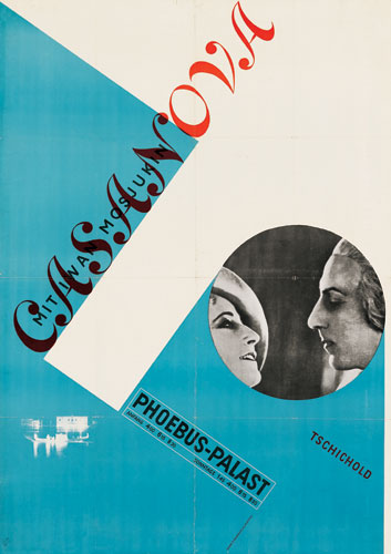
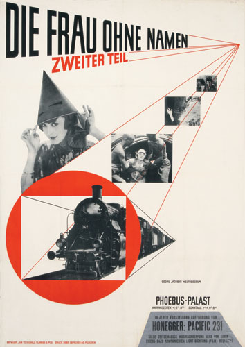
 Jan Tschichold was on of the greatest, most outstanding German typographer of the 20th century. He was also an Author that wrote books such as:
- "Die neue Typografie" (1928)
- "Typografische Gestaltung" (1935)
- Transit (1931)
- Saskia (1931/1932)
- Zeus (1931)
- Sabon (1966/1967)


----------more will be written on J.T--------------------
 Josef Muller Brockmann.
These are examples of his work:


Grid-ness

Grid.
We all love grid.
Can't live without them.
Period.
But what is grid?
I know what it is, but the more I say the word GRID, the more I don't know what it is!
#grid.grid.grid.grid.grid.grid.grid.grid.grid.grid.grid.grid.grid.grid.#
Grid is :
Yes. I literately copy and paste that. As far as I know, the grid I was talking about is grid #4.
But after reading my awesome 'text book' a.k.a. The fundamentals of Typography, I learned that a grid is actually a modernist structure that uses numbers to identify the different cuts. It also breaks space or time into regular units. [Uuuuu]
The reason why WE designers use a grid is because, it makes our lives easier. Specifically, as it was mention on the text, it is intended to make type selection simpler and ultimately more useful. It is a system where you could establish arranging content with in the space of page, screen, or built environment.
For example: Varying a character width is easily achieved by moving one row down the grid from 55 to 65.
And as life continues, we found out that grid has manykids kinds. One of them are called modular grid. Modular grid is a grid that has consistent horizontal divisions from top to bottom in addition to vertical divisions from left to right.
Enough with the grids. There are other things I need to know more about, such as:


But what's not confusing is hierarchy. Because hierarchy is a logical and visual way to express the relative importance of different text elements by providing a visual guide to their organization. Ways to achieve a clear hierarchy is by gaining up a weight to a sentence to reinforce its importance.
Then there's 'type family' which is a complete set of type suitable for printing text.
And 'type styles' which is a specific style of type, like Arial.
The End
We all love grid.
Can't live without them.
Period.
But what is grid?
I know what it is, but the more I say the word GRID, the more I don't know what it is!
#grid.grid.grid.grid.grid.grid.grid.grid.grid.grid.grid.grid.grid.grid.#
As usual, when stupidity knocks on your my front door, the first thing you I do is go to: www.dictionary.com.
SO! According to the Dr. Dictionary,Grid is :
| 1. | a grating of crossed bars; gridiron. |
| 2. | Electricity.
|
| 3. | Electronics. an electrode in a vacuum tube, usually consisting of parallel wires, a coil of wire, or a screen, for controlling the flow of electrons between the other electrodes. |
| 4. | Surveying. a basic system of reference lines for a region, consisting of straight lines intersecting at right angles. |
| 5. | a network of horizontal and perpendicular lines, uniformly spaced, for locating points on a map, chart, or aerial photograph by means of a system of coordinates. |
| 6. | Architecture. a rectangular system of coordinates used in locating the principal elements of a plan. |
| 7. | grillage. |
| 8. | Football. gridiron (def. 1). |
Yes. I literately copy and paste that. As far as I know, the grid I was talking about is grid #4.
But after reading my awesome 'text book' a.k.a. The fundamentals of Typography, I learned that a grid is actually a modernist structure that uses numbers to identify the different cuts. It also breaks space or time into regular units. [Uuuuu]
The reason why WE designers use a grid is because, it makes our lives easier. Specifically, as it was mention on the text, it is intended to make type selection simpler and ultimately more useful. It is a system where you could establish arranging content with in the space of page, screen, or built environment.
For example: Varying a character width is easily achieved by moving one row down the grid from 55 to 65.
And as life continues, we found out that grid has many
Enough with the grids. There are other things I need to know more about, such as:

Margins a.k.a border, is the space around the printed or written matter on a page.

Columns, a vertical row or list.


Gutter, which I think, is the white space formed by the inner margins of two facing pages in a bound book, magazine, or newspaper.
And flowlins, is... to be honest with you I have no clue what it is. It could be a line that flows.. like a horizontal line? Maybe? maybe not because it's not even a LINE. Which is really confusing. I know, I fail.
Note to self: ask THE teacher!
Note to self: ask THE teacher!
But what's not confusing is hierarchy. Because hierarchy is a logical and visual way to express the relative importance of different text elements by providing a visual guide to their organization. Ways to achieve a clear hierarchy is by gaining up a weight to a sentence to reinforce its importance.
Then there's 'type family' which is a complete set of type suitable for printing text.
And 'type styles' which is a specific style of type, like Arial.
Subscribe to:
Posts (Atom)
